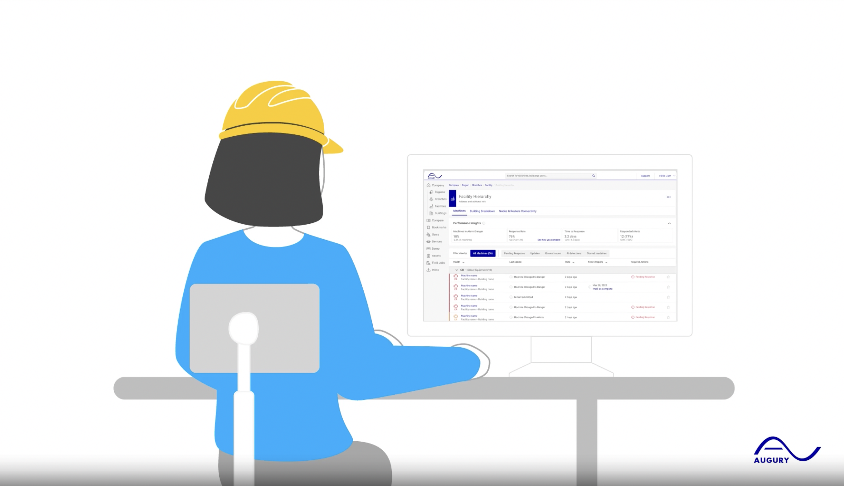
With a series of User Experience enhancements for its Machine Health dashboard, Augury continues its quest to better empower manufacturing maintenance teams. Facility workers now have three tabs to more easily monitor their site, track progress, and share wins. “It’s all about turning complex things into simple experiences,” says Augury’s Head of Design Guy Laor.
Power to the Plant Floor
“I am a design thinker and I’m 100% sure that design can bring world peace, or at least solve most of the problems on Earth,” smiles Guy Laor, who joined Augury as Head of Design in April 2021. “Design is more than making things look pretty. It’s a way to solve problems: to make something clear, communicative and humanized. It’s all about turning complex things into simple experiences.”
The recent enhancements to Augury’s Machine Health dashboard sits nicely within this vision. And to simply express one particular aspect of Augury’s work: machines can’t run without people – and it’s the people who keep the machines running who should get all the credit.
Augury’s newest UX updates are all about empowering those on the plant floor and putting the spotlight on their wins and performance. With this new experience, users can work more efficiently and get the recognition they deserve.
Journey of Continuous Improvement
As Augury undergoes rapid growth, Guy and his team are taking on all Augury’s design challenges across the board. “Our user journey consists of online and offline experiences: we have teams, technicians, sensors we need to install, customer support, etcetera. So, there will always be opportunities to improve as a platform everyday – it’s a continuous movement.”
Meanwhile, Augury clients are also on a journey of continuous improvement as they try to maximize the output of their machines and processes. And to maintain the momentum and motivation going, organizations need to keep tracking and sharing wins, KPIs and ROI.
Now with Augury’s latest updates, sharing is easier, faster and more tangible. Who made the most hours of downtime? How do those saved hours translate in terms of saved revenue? Let’s find out…
1) Machine to Notice: Performance Insights
With the Machine to Notice (MTN) page, facility users have more control and can actively track chosen KPIs – such as % of alarm states, response rates, and response times – related to Machine Health, engagement and adoption. This page can also clearly show how different sites rate across an organization.
“This page is really about automation,” says Guy. “It’s about taking away an offline task like hanging up a leaderboard every week. It brings this task online and into real-time – while also being consistent, clear and easy to absorb. It also represents another clear design and UX KPI: overall less effort required from our users by reducing the number of tools being used by a particular team.”
“Humans want to succeed. We all want to become better.”
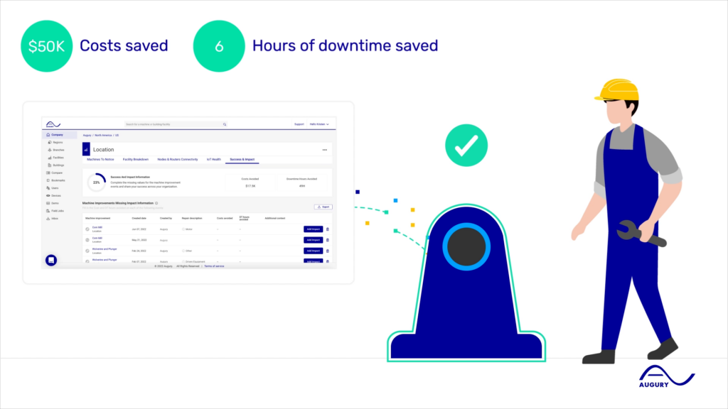
2) Success & Impact: Tangible Results
The purpose of the Success & Impact page is to make it easier for facility users to share key tangible wins based on pre-set KPIs such as cost reduction or hours of avoided downtime. “Here it’s all about motivation. Humans want to succeed. We all want to become better,” says Guy. “And here it’s very easy for people to track their progress and how they rate with other sites. It also inspires constructive conversations. What works? What doesn’t?”
3) IoT Health: Total Overview
The IoT Health tab shows you the health status of all of Augury’s hardware in a single effective view. “This is more than just a time-saver in terms of being able to scan quickly for any problems,” says Guy. “It’s also a story about trust. Like trusting the gas tank meter to tell you when you need to fill up. We want to make sure we can inform the driver if the sensor is broken and whether this will have an impact on the information it provides to the driver – so it doesn’t say ‘full’ while it’s actually empty.”
“In a world full of information, people are looking to simplify things so they can focus on the most important things.”
Onward And Upward
In short, Augury’s dashboard updates allow maintenance teams to actively track progress, share success stories, and better monitor their facility. “It’s our job to keep moving forward,” says Guy.
“And we will keep working at making their jobs even easier. In a world full of information, people are looking to simplify things so they can focus on the most important things – in our case making sure the production lines keep running at their best. Design and design thinking has an instrumental part in supporting that.”
For all Augury clients: check out the updates on your platform! For newcomers, contact us today. We’d be happy to give you a demo.