Time To Scale On Ambition
Everyone agreed: “It was all rather blue…”
Augury began as a classic startup over a decade ago: bootstrapped and based in the garage of the parents of one of our Co-Founders, Gal Shaul. Together with Co-Founder Saar Yoskovitz, they – in the grand startup tradition – “moved fast and broke things”. And our simple blue logo and the additional tell-tale wash of blue that usually accompanied any communications with the outside world started in that garage.
But after achieving Product-Market Fit and explosive growth, these quick branding fixes were now a liability. It no longer fit what Augury had become – and the assets it now had at its disposal. In particular, the acquisition of Process Health pioneers Seebo, allowed us to start dreaming beyond being leaders in Machine Health. We could now embark on a quest for full Production Health. Our powerful new unifying promise needed an equally powerful unified brand.
“Now we promise solutions that can meet more of the industry’s challenges while still empowering the workforce and helping safeguard the planet.”
“And now with the rebranding process complete, we arrived at a big promise that we can all get behind – that is truly us. Now we promise solutions that can meet more of the industry’s challenges while still empowering the workforce and helping safeguard the planet,” says Augury’s VP of Marketing, Michal Rutzky.
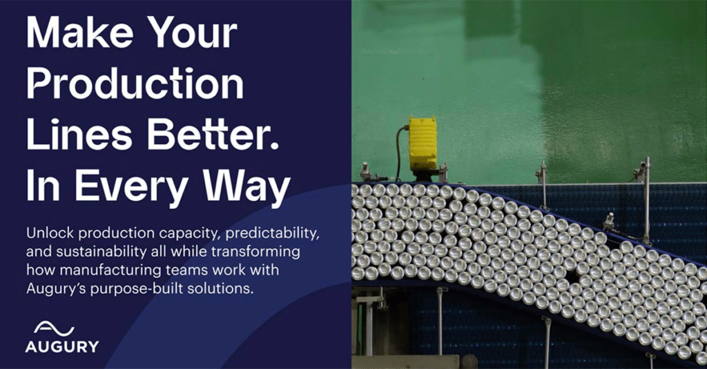
WHAT IS PRODUCTION HEALTH?
Production Health transforms manufacturing and industry by removing friction created by competing business goals. By using AI-driven insights into the machines, processes and operations, companies can improve business outcomes, empower their workforce, and achieve sustainable production – all at the same time.
Finding That New Promise
By the beginning of 2022 after Augury and Seebo had officially merged, Augury’s Head of Design Guy Laor knew it was time to officially start the rebranding process. “It was in the air for a while. But we needed to wait for the dust to settle and make sure everyone was ready for this kind of move. It’s a big step…”
“We definitely argued a lot,” smiles Guy.
The first phase in determining the strategy was to bring everyone together: to put all the DNA of the two merged companies into a big pot, stir and see what rose to the top.
“On a cultural level, the two companies were already very similar. There’s an openness that encourages questioning and embracing everyone’s ideas,” says Michal. “So, every detail and idea were carefully scrutinized.”
“We definitely argued a lot,” smiles Guy. “There were so many ideas on the table. And then based on that we had to synthesize the main brand essence – something that’s super clear. It needed to represent Augury and also feel fresh. At the same time we had to avoid taking a little of this and a little of that to make everyone happy, with the result being a mediocre pastiche – a Frankenstein…”
Happily, after going down many rabbit holes, they found the carrot – a brand essence everyone could get behind.
And then we found it: Thrive.
Nailing the Essence
It became clear that Augury had to reach beyond its bread-and-butter of ‘Machine Health’ or ‘Process Health’. Production Health had raised the stakes and we had to seek higher for a bigger story…
And then we found it: Thrive.
“Once the branding agency presented ‘thrive’, everyone immediately agreed: this was what we wanted to bring out into the world,” says Guy. “And while we might not use the exact term externally, it does energize everything we do. It’s the atomic core of our brand.”
“But now we had a new challenge: the tagline,” says Guy. “We had to beat the original one – ‘Machines Talk, We Listen’ – which is really great but no longer conveys what we are about.”
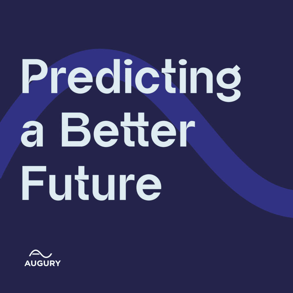
Fortunately, ‘Predicting a Better Future’ appeared quickly – and from there, the vision and mission also arose almost naturally. As of October 2022, it was time to move forward on the creative phase.
“There are always a lot of emotions involved during a rebranding process,” says Michal. “ It was interesting to see how we first had to go all over the place in search of the brand essence. And then we realized that it’s not actually too far away from where we already are. It just needed to be refined and distilled – while still connecting to these same emotions.”
BEFORE
TAGLINE: Augury. Machines talk, we listen
VISION: A world where people can always rely on the machines that matter.
MISSION: To give our customers superior insights into the health and performance of the machines they use to make products, deliver services and improve livesNOW
TAGLINE: Augury. Predicting a better future
VISION: A world where the combined work of people and machines makes life better in every way.
MISSION: To provide insights into the health of machines, processes and operations to transform how people work and what they can create.
Phase II: The Creative Expression
“With a strong statement like ‘Predicting a Better Future’, you need to come backed by a strong brand personality,” says Michal. “We need a voice that’s big and positive about the future of both manufacturing and the world.”
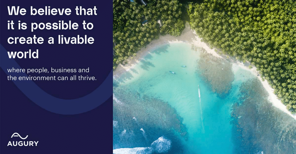
AUGURY’S NEW PURPOSE: Where the predictive power of artificial intelligence transforms the world so businesses, people, and our planet can all thrive.
Guy entered the whole rebranding process imagining a very disruptive brand expression – like the disruptive effect that Augury’s approach was having on the manufacturing industry at large. “I saw a brand that has never been seen before in this industry – something completely wild that broke down all the industry’s paradigms.”
“We definitely needed to be bold, but also reassuring to both current and future customers,” says Michal. “After all, we have the solutions for manufacturers facing climate commitments and challenging economic times. And we are now in a place where we can help them even more. We needed to communicate that.”
“In the end, there was more of an evolution than a revolution,” says Guy. “Perhaps we didn’t get the crazy new brand, but we did get to a place that was still very fresh and new.”
But first, there were a few more hurdles.
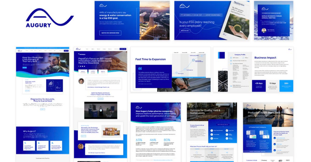
Logo Showdown: Radical vs Heritage
“There were long and crazy discussions around the logo,” says Guy. “As a designer, I was looking at the old logo and saw how difficult it was to work with and how it’s not balanced or strong.”
Certainly, a new logo would be an easy way to mark the transformation Augury has undergone. On the other hand, there was a strong case to preserve some visual DNA and build on the strong heritage of the original logo’s sound wave. In the end, it was decided to go for balance: between reflecting the strong and forward-thinking vision, while also conveying this sense of being familiar and comforting.
“So, we had many iterations: changing the size of the wave, playing with the internal composition of the logo itself and how it works with the tagline,” says Guy. But it was only when Augury’s inhouse design team started to collaborate more closely with the branding agency team in terms of sharing sketches, did the process open up and a logo was created that everyone could be proud of.
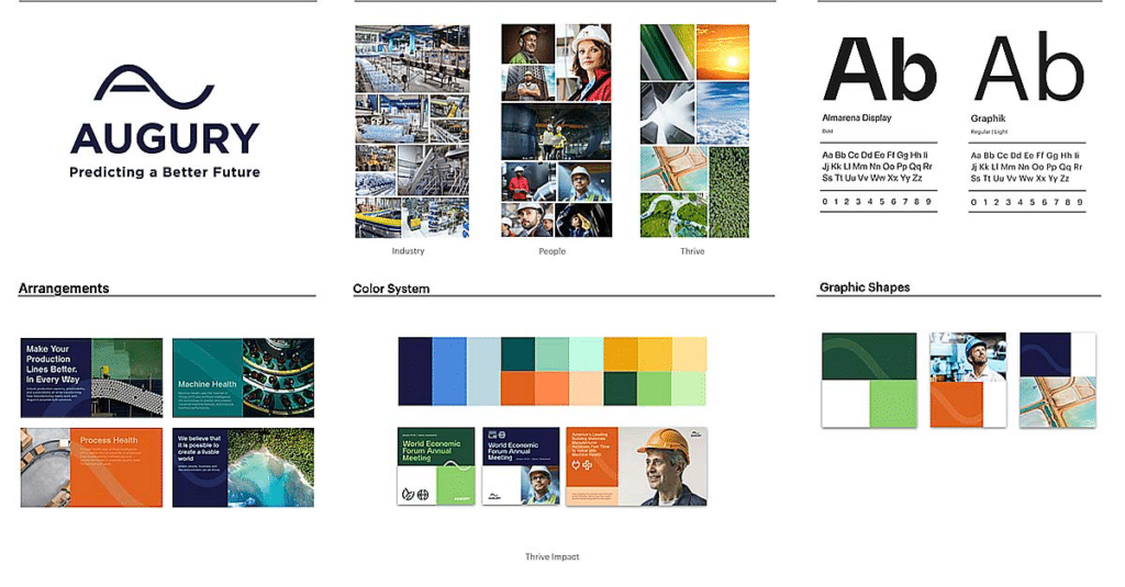
The wave of sound is now the waves of change – the forward momentum of thriving. “The logo, and in particular the wave, is now at a place we can really leverage as part of the look and feel of the brand, not only as we grow as a company but as we build a whole new category. The wave has become part of the design language – including the unique font we chose,” says Michal. “We took our Nike swoop and brought it to the next level.”
Speaking To Different Personas
Throughout the creative process, a lot of thought went into the particular challenge of B2B marketing: how to connect with two radically different personas: C-Suite who oversee the budgets, and the people on the floor paying with their time.
“For me it’s simple,” says Guy. “It’s not about B2B, it’s about H2H – human-to-human. And we talk to each of them on a content level. For them, the brand is just the background to the real discussions. And in fact, Augury had already become experts in dealing with these different hot potatoes and finding ways to offer the right reassurance and support. And that’s why I think ‘thrive’ hit such a nerve – because that’s something everyone wants.”
“At the end of the day, we are dealing with people,” says Michal. “They need to feel comfortable, and trust that you are dealing with their concerns – whether it’s hitting the right KPIs, or being able to not worry about work on weekends. And when they believe you will keep your promise, this is what creates this emotional bond of trust that defines a successful brand.”
Beyond Blue: The New Color Palette
“For me, the most important part of the whole process was the new color palette,” says Guy. “It really showed the big change and opened up the brand. Yes, blue remained: but it became darker and deeper and came with a whole range of complementary colors that differentiated us from the industry – as did the new font. And by naming these colors it helps give a deeper sense of purpose. It brought in the story of the new brand and reflected our vision and mission.”
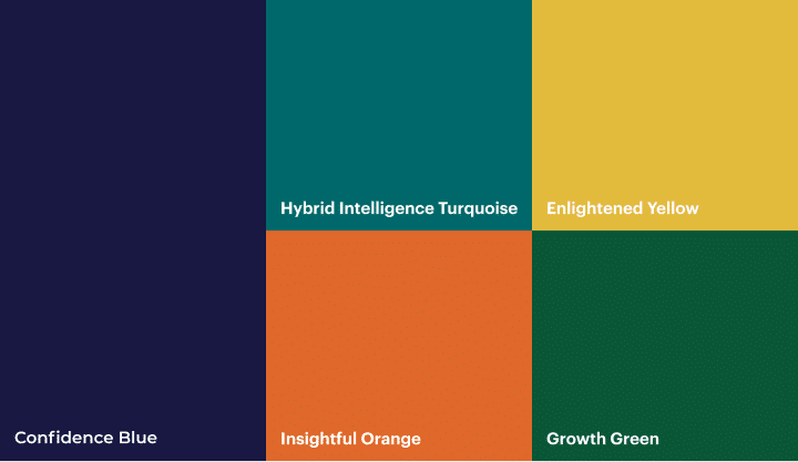
“I think the solid and strong colors speak to all personas and the three elements of Profit, People and Planet,” says Michal. “They carry and reinforce our mission and vision – along with the wave and bringing the wave back into the font we are using. Everything is coming together to support each other. The brand supports the vision and mission; the vision and mission support the brand. And for me, this is what will create that trust and consistency throughout.”
And Now… Letting It Thrive In The World
Now as the branding gets another layer by getting combined with the real world – with, for instance, the wave image fusing with both nature and industry – it’s also time to release the full package into the real world.
“While we need to stay creative, we need to do this within the boundary of the brand so people can start identifying with it,” says Guy. “And once the brand essence is totally in our blood, we can start working to not only keep it consistent, but also give it enough room to grow, expand and evolve.”
“I’m feeling very confident about the road ahead,” says Michal. “Not too many companies that rebrand are able to build such a significant bond between the mission and vision, and the way that the brand looks, feels, behaves and talks. And we achieved this as a team. As the expression goes: it takes a village.”
So goodbye old blue. It’s time to welcome a better – and even more colourful – future.